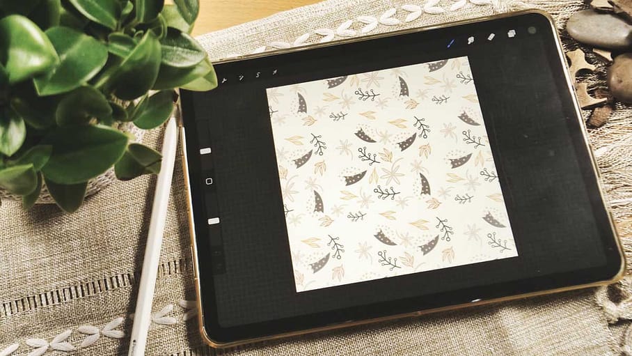
When creating artwork in Procreate, choosing the right color profile can make a big difference in the final result. The two most common color profiles used in digital art are RGB and CMYK.

Learn Procreate for Beginners
FREE CLASS with everything you need to know
about Procreate for digital painting.
RGB Colour Profile
RGB stands for Red, Green, Blue, and is an additive color model used for digital displays such as computer screens and mobile devices. In this color profile, colors are created by adding varying amounts of red, green, and blue light together.
RGB is the default color profile in Procreate, and is generally the best choice for digital artwork that will be viewed on screens. This includes digital illustrations, graphic design, and web design.
But - if you create artwork e.g. for Spoonflower they also want you to use RGB. They print digitally on cloth and usually you'd expect that they want you to work in CMYK bu that's not the case. Beside that, RGB has more colours and is generally the brighter choice so it's a good thing!
CMYK Colour Profile
CMYK stands for Cyan, Magenta, Yellow, and Key (which is black), and is a subtractive color model used for print materials. In this color profile, colors are created by subtracting varying amounts of cyan, magenta, yellow, and black ink from a white background.
CMYK is the color profile used by most professional printers, and is the best choice for artwork that will be printed on paper or other physical materials. This includes posters, flyers, business cards, and other print materials.

If you create patterns for Spoonflower make sure to choose the RGB Colour mode although the rule is to use CMYK for print.
Choosing the right Colour Profile
When creating artwork in Procreate, it's important to choose the right color profile based on how the artwork will be used. If you're creating artwork that will only be viewed on screens, such as digital illustrations or social media graphics, the RGB color profile is the best choice.
If you're creating artwork that will be printed, such as posters or flyers, the CMYK color profile is the best choice. This will ensure that the colors in your artwork are accurately reproduced in print.
But keep in mind: There are exceptions from the rule! So if you work with specific Print on Demand Services make sure you check out their requirements.
Converting Colour Profiles
If you've created artwork in Procreate using one color profile, but need to convert it to another for printing or other purposes, it's important to do so carefully to avoid color distortion.
To convert your artwork from RGB to CMYK, go to the "Actions" menu, select "Canvas," and then choose "Edit Drawing Guide." From there, you can select "CMYK" as your color profile.
To convert your artwork from CMYK to RGB, go to the "Actions" menu, select "Canvas," and then choose "Edit Drawing Guide." From there, you can select "RGB" as your color profile.
Conclusion
Choosing the right color profile is an important step in creating high-quality artwork in Procreate. By understanding the differences between RGB and CMYK, and when to use each, you can ensure that your artwork looks its best whether viewed on a screen or printed on paper.
Wanna learn more about Procreate?

Learn Procreate for Beginners
FREE CLASS with everything you need to know
about Procreate for digital painting.
