0,00 €
Cart
Do you want unlimited Access to all Printables? Join the Pepper Printable Club!
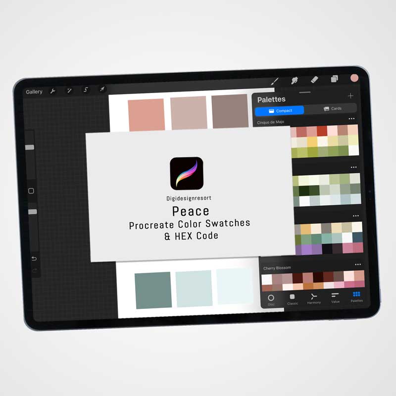
Peace: A Serene Procreate Color Palette Inspired by Tranquility
2,00 €
What’s Included:
- A Procreate color swatch file featuring a harmonious blend of pastel-inspired shades.
- A HEX Code color sheet for easy use in multiple design platforms.
- Instant digital download for immediate artistic use.
Sustainable Artistic Exploration: As a digital product, “Peace” supports eco-friendly art practices, offering a sustainable approach to creativity.
Let the “Peace” palette inspire your art and designs with its earthy charm and natural elegance, perfect for a wide range of creative projects.
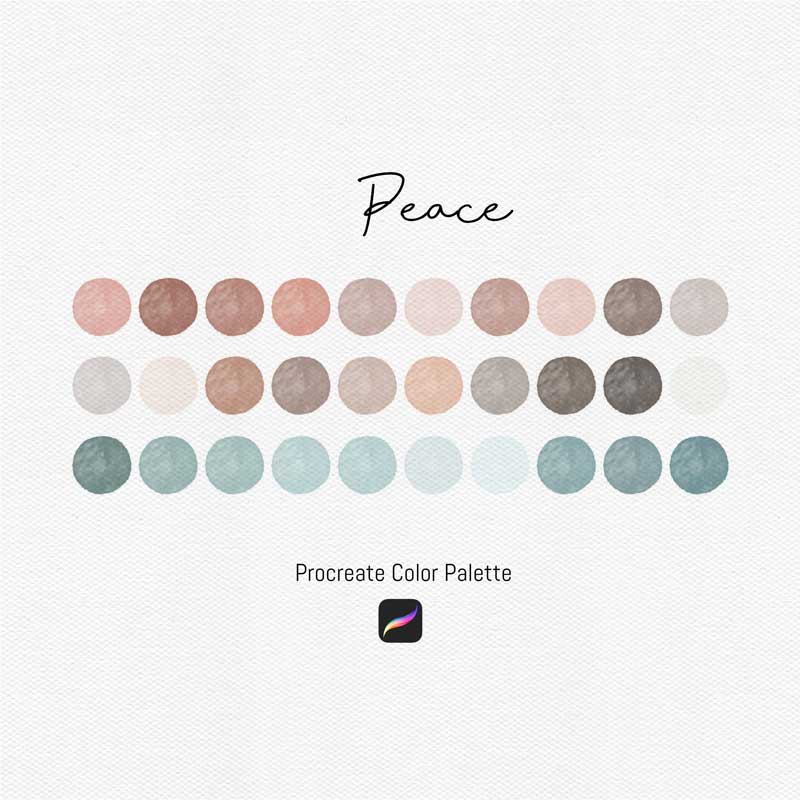
Introducing “Peace,” a Procreate color palette meticulously designed to embody tranquility and serenity in your digital art. This palette harmoniously blends peachy hues, soft blues, light greys, and tealed browns with touches of pristine white to create a sense of calm and peacefulness. Ideal for artists and designers seeking to convey a soothing atmosphere in their work, “Peace” is perfect for illustrations, background art, and any project where you wish to evoke a serene vibe.
Creative Possibilities for a Range of Artists:
Designers: Use “Peace” to design calming websites, graphics, and digital layouts that invite viewers into a serene digital space.
Illustrators: Craft illustrations that tell stories of tranquility and quiet moments, utilizing the palette’s soft tones to draw viewers into a world of calm.
Crafters: Dive into digital crafting with “Peace,” designing digital papers, fabrics, or unique crafts that bring a soothing touch to any space.
Artists: Explore themes of peace, nature, and mindfulness in your art, guided by a palette that promotes a sense of well-being and relaxation.
Palette Highlights:
Peachy Hues: Soft and inviting, these peach tones add warmth and a gentle energy to your creations, perfect for capturing the first light of dawn or the delicate textures of nature.
Soft Blue: Reminiscent of a serene sky or calm waters, the soft blue shades in “Peace” offer a cooling touch, bringing balance and depth to your artwork.
Light Grey: Subtle and sophisticated, light grey tones provide a neutral base, allowing for versatility and refinement in your compositions.
Tealed Brown: These unique tones blend the earthiness of brown with a hint of teal for a modern twist, grounding your work with a touch of nature-inspired stability.
Soothing White: Crisp and clean, the added white tones serve as a breath of fresh air, enhancing the overall harmony and providing contrast to highlight the beauty of the other hues.
“Peace” is not just a color palette; it’s an invitation to infuse your digital art with a sense of serenity and mindfulness. Embrace the calm and let these carefully chosen colors guide your creative explorations.